Sports Streaming Service
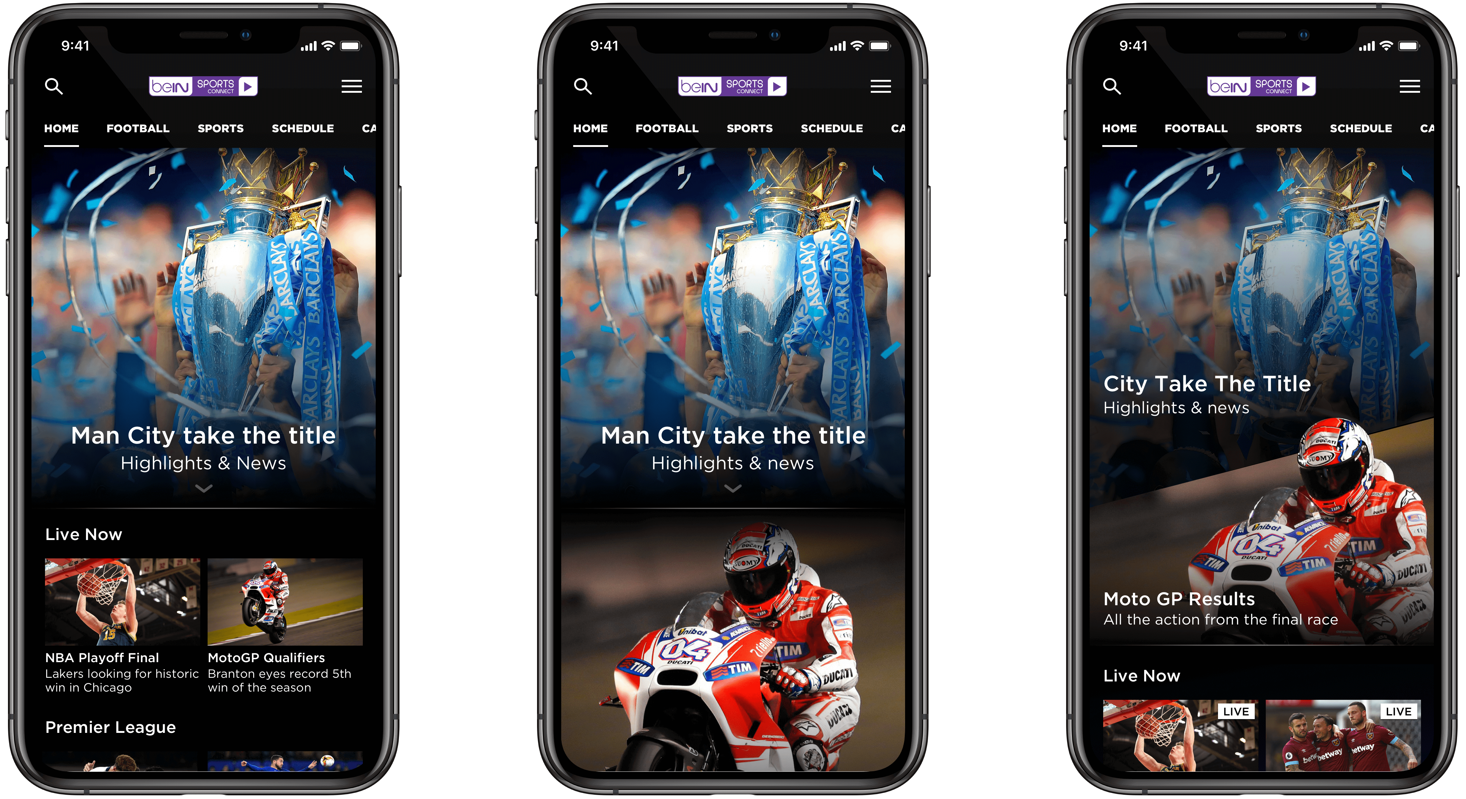
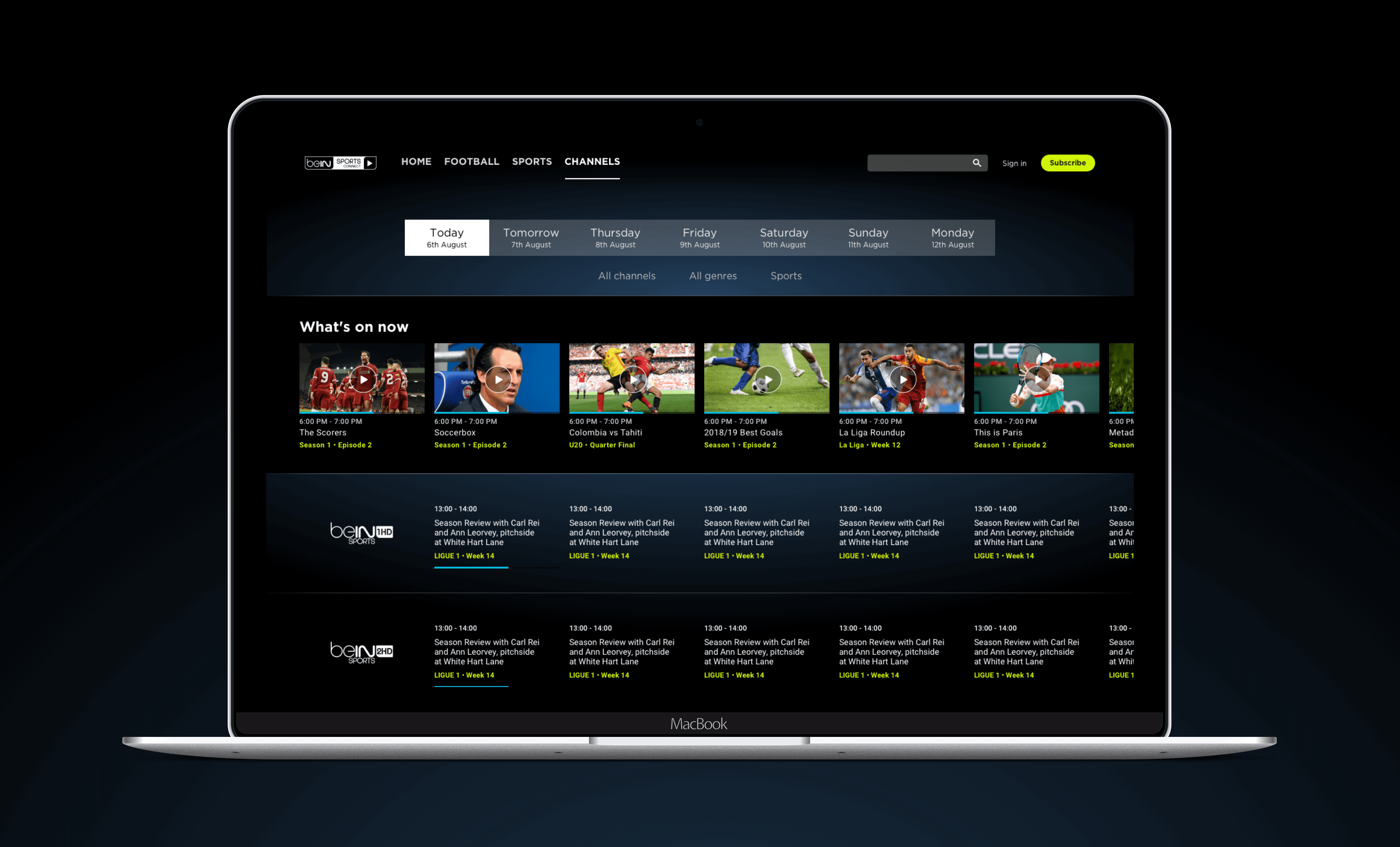
This 6 month contract involved working on the interface design and overall look and feel for a global sports streaming service. This included native mobile apps for both Android and iOS, responsive web and large screen experiences.
Visual exploration
The first phase of the project involved general exploration for the look and feel of the combined service. The end client wanted a contemporary update to their visual style, conveying an elegant and premium product. As a team we collated examples from a range of competitors and general sports related mediums from which inspiration could be gathered. This allowed us to quickly discard styles which we felt did not contribute towards the direction we were taking.


Ideation
The defining challenge when it came to ideation and concept design was to create a UI that felt fresh and bespoke, while utilising a relatively well defined design system. We began with some rough exploration of ideas which could then be refined towards a closer relationship with the design system in question.

Rapid design and delivery
The client was regularly presented with separate pieces of the evolving UI design work, allowing UX, design and development to contiune in parallel at a rapid pace. Many features could be put into development while others were still going through a review/revision process.

Presentation protptypes
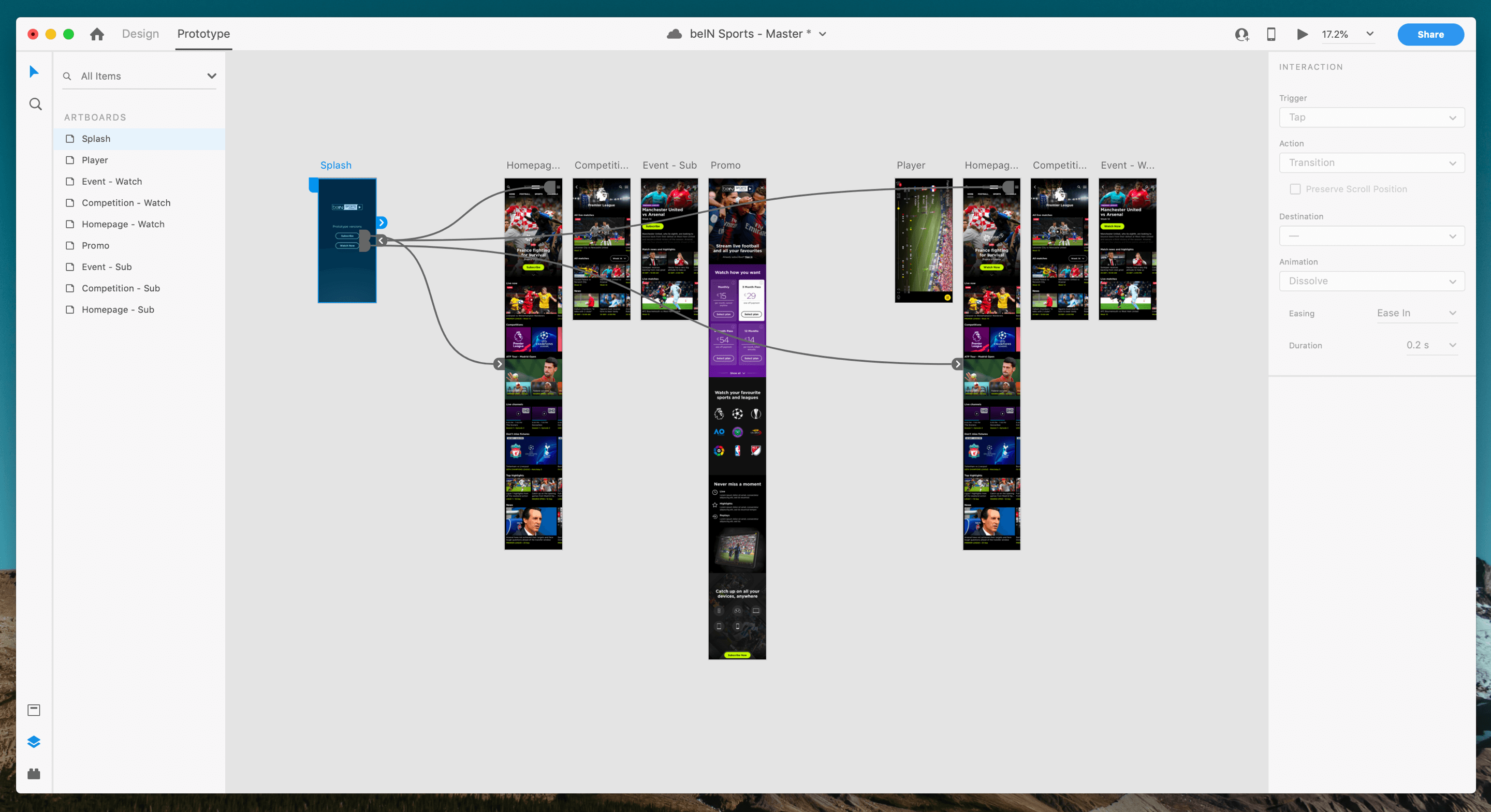
Throughout the lifecycle of the project the end client requested simple, click-through prototypes which they could use to present back to stakeholders within their company. These also helped to visualise how well individual sections of the UI worked together as part of the overall experience. Various tools were used to provide these, including Marvel, inVision and Adobe XD.

Preparing re-useable assets & style guides
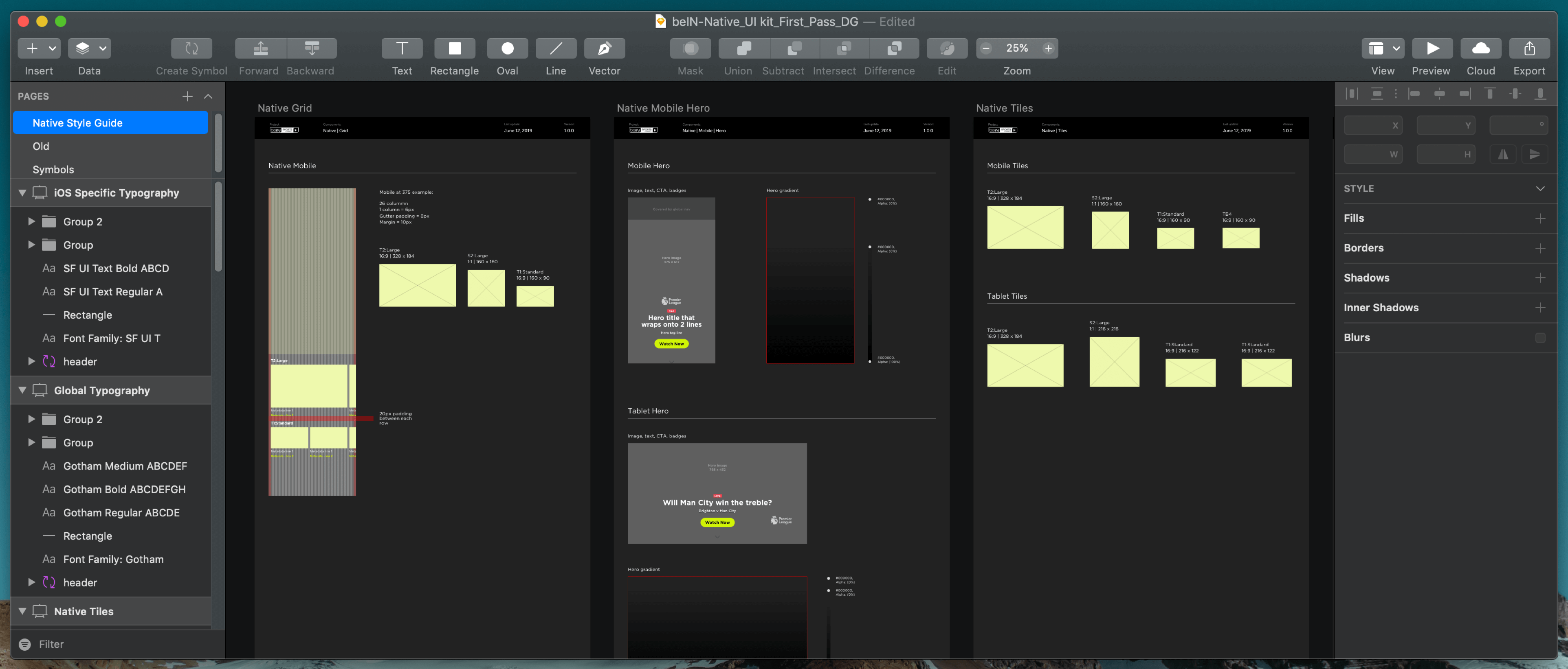
With design work becoming more refined we were then able to begin the production of assets that could be re-used across the UI, allowing responsive web and mobile versions to both be easily designed and developed. Common assets such as content tiles were placed into style-sheets which various designers could then use to populate any future variants that the client wished to see mocked up.

